Kreigsmarine Camouflage 1939 - 45
By: Daniel H. Jones
The following is a compilation of some of the information I have acquired
over the past several years. I am grateful for the help I have received from
other modelers who have offered their support for this project. In particular,
I want to thank Falk Pletscher, who did translations of some German language
material and added commentaries. Falk also supplied the Humbrol mixing matches
for the colors which will be published in part II.
When writing about naval camouflage some serious problems arise. Information
is usually sketchy at best and is to be found, if at all, in bits and pieces
scattered through various books. It is much like assembling a jig-saw puzzle,
with a large number of pieces missing. The USN camouflage systems are well
documented and in most cases the paint formulas and original color chips exist.
Such is not the case with some of the other major naval powers of WWII. In
contrast to military aircraft colors, ship camouflage colors are not well
documented and some of the published material is contradictory. In the case
of the Kriegsmarine the situation is worse because Germany lost the war. Much
original source material was lost in the aerial bombing of German cities and
more was deliberately destroyed at the end of the war. Tons of German naval
records did survive the war to be captured by allied forces. This captured
booty was placed in storage, mainly in England, but with no attempt made to
organize or index the material. Beginning in 1965 these historical records
were gradually returned to Germany, but still in disorganized and fragmentary
form. In this disordered state, some of the information when taken out of
context could be misleading. Many former officers or officials who might have
been able to explain documents or place them in their proper context are now
deceased. Thus there are probably gaps in information that may never be filled
and many questions may remain unanswered. The following text is therefore
somewhat speculative and is based entirely on secondary published sources.
It represents the best we can do at the present time.
One of the difficulties in dealing with Kriegsmarine colors that, unlike the
army or Luftwaffe, the navy did not use RAL numbers in its painting instructions.
RAL is an color authority much like the familiar Federal Standards, (FS-595
and its derivatives), and is still in use today. Since the navy developed
its own range of colors independently it makes matching them much more difficult.
Including interior finishes and primers, 36 colors have been identified. There
is only one book that has dealt with German naval camouflage in detail, and
much of the information therein is of a generalized nature. There are a few
colors listed for which specific applications are not stated. Much of the
material in this article is based on this single book, Anstriche und Tarnanstriche
der Duetchen Kriegsmarine by Deiter Jung, Arno Abendroth, & Norbert Killing.
(Munich 1977), (hereafter referred to as A.T.D.K.). Even though the main body
of the text is in German, the book is still an excellent resource as it contains
hundreds of photos of ships in camouflage. The photos have both German and
English captions but unfortunately they are seldom specific regarding the
colors. A bibliography of additional source material will be listed at the
end of the series.
With the creation of the new Kriegsmarine in the 1920's, the ships were painted
in a continuation of the same systems that were used during the First World
war. The standard peacetime color scheme for major warships was actually based
on a specification dating from 1896. Painting instructions specified the following
colors for warships.
Deckfarben fur Auben, (Finishing colors for outside), Dunkelgrau, (dark gray)
51, Hellgrau, (light gray), 50. and, Teerfirnis, (tar varnish), (black). Tf
99.
Shiffsbodenfarben, (ship bottom colors - below the waterline) was red, in
four designations, S.B. I, II, III, and IIIA.
Wasserlinienfarben, (waterline color), was W.L. I and III Grau. (gray - 23a
and 23b).
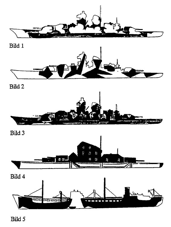
|
Drawing
Not to Scale
|
|
|
|
Bild 1 - Bild 5
|
The hulls were to be painted dark gray 51 and the superstructure in light
gray 50. (Some have suggested that there was another much lighter gray that
was used as a superstructure color, but there is no official confirmation
for this. Probably this opinion is based on photographic interpretations.
Some photos of German ships show upper works that appear almost white but
this is probably the standard light gray 50 photographed in bright sunlight).
Smaller warships, old torpedo boats and minesweepers, and some auxiliaries
such as MT-1 and MT-2, were painted in Tf 99, (black) overall, sometimes with
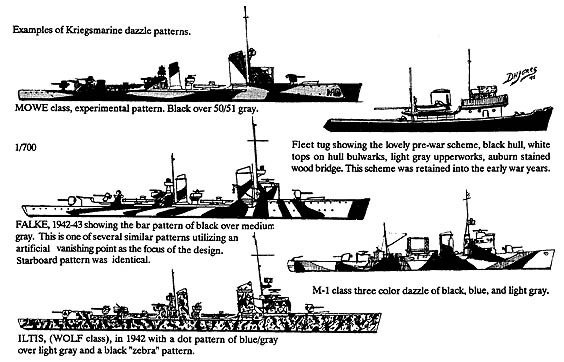
white lines on the hull. Fleet tugs had a particularly attractive finish,
black hulls. white line topping the hull bulwarks, light gray 50 upper works,
and the bridge in dark varnished wood. Canvas railing covers were off white
or light gray. When the new destroyer classes commissioned in the thirties
the old Tf 99 painted torpedo boats were repainted in the dark gray/light
gray scheme to match the destroyer colors.
Decks were painted Tf 99 if steel plating, natural wood if planked. Cruisers
and battleships had wood planking on main deck and 01 levels. Only the light
cruiser KONIGSBERG had a deck of steel plates. Bridge and signal decks were
planked. Deck houses were covered with a brownish colored linoleum. On some
srnaller ships, wooden decks were removed, being replaced with plating. The
Type 35 minesweepers had planked main decks but the others from Type 40 onward
had metal plating.
In the official painting instructions some directions were included about
camouflage applications. These refer to four colors, (products 30-33), but
nothing was said about the kind of camouflage. Presumably this referred to
the experimental trials during naval maneuvers in the late twenties. Some
experimental schemes were tried on torpedo boats of the MOWE class in 1927-28.
SEEADLER was painted a bottle green, FALKE was in the two gray, 50/51 scheme,
while GREIF had another gray. During the early to mid-thirties these boats
were painted black like the older torpedo boat types but, from 1935 onward,
were painted in 50/51 grays again. Several photos are presented in A.T.D.K.
showing the MOWE class vessels with different patterns of dark gray or black
applied over the 50/51 finish. A photo of WEICHSEL, run aground in August,
1938, shows another one color pattern over the 50/51 finish. The target ship
ZAHRINGER carried a multi-colored pattern, (exact colors not known), for a
long time, perhaps until the beginning of the war. Therefore it is obvious
that some testing and analysis was done regarding ship camouflage between
the wars but few reports were generated by these tests. The trials had little
impact on policy and did not result in any specific directives regarding camouflage
painting in the event of war. Later, when the test data was recreated for
analysis during the war, the resulting compilation was destroyed before the
surrender.
|
Drawings
Not to Scale
|
|
|
|
Bild 1 - Bild 5
|
The standard 50/51 gray scheme carried over into the early years of the war.
The Norwegian campaign saw the first widespread use of camouflage patterns.
Destroyers operating in the Norwegian Fjords used a dazzle or striped pattern,
applied in broad bands to make them blend into the background of rocky and
snow covered cliffs. The first wartime camouflage patterns, using black or
very dark gray, (and possibly dark blue), were often applied in patterns directly
over the peacetime 50/51 scheme thus creating a three color design. The light
color areas that appear to be in white on some of the photos of wrecked German
destroyers in Norway are probably the underlying light gray 50 from the peacetime
scheme. A dark slate, or steel, gray also came into use about this time. This
dark gray was applied over all vertical surfaces replacing the 50/51 scheme.
BISMARCK was painted in this color after her breakout from Norway into the
North Atlantic.
In 1942 Korvettenkapitan Dechend, who had served on the ADMIRAL HIPPER until
November, 1941, wrote a memorandum summarizing his experiences with the fleet.
In this document he not only compiled camouflage patterns but also critiqued
them and gave some practical suggestions. Dechend recommended mixing standard
colors together in order to create new shades, a practice strictly forbidden
in the official painting instructions. Mainly, he recommended that local commanders
should be able to decide what types of camouflage to use, based in principle
on color sketches and references to color mixes. The official instructions
should only be used as a guide.
Published excerpts of Dechend's memorandum suggest it was mainly theoretical
in nature, taking in terms of general design principles and objectives. The
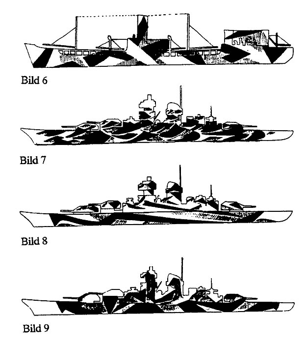
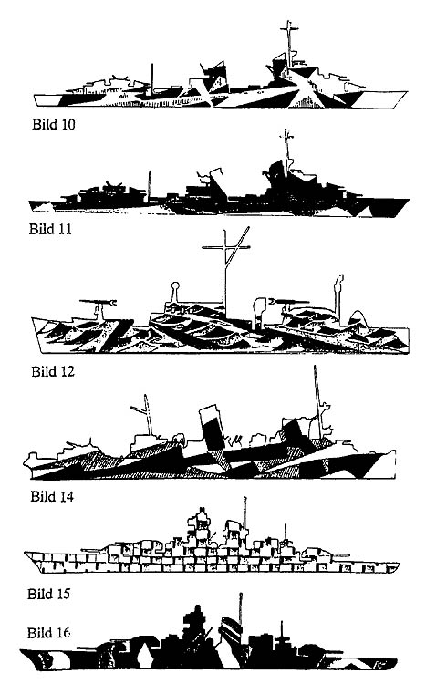
sketch drawings were included to illustrate the ideas. Sketches labeled "Bild
1-12" show Dechend's suggestions on principle colors and patterns . "Bild
14" shows his critique and corrections of an existing pattern carried by the
mine ship WULLINWEVER, depicted as "Bild 13". "Bild 15-16" show further suggestions.
All of these designs are reproduced, (in color), in A.T.D.K.
After this document was printed, Flottenchef, (CinC of the Fleet), Admiral
Schniewind gave orders to test these design ideas in the fleet. From photos
we know that SCHANHORST carried a pattern based on "Bild 7", LUTZOW was painted
in one inspired by "Bild 8" and one of the patterns for TIRPITZ was influenced
bv "Bild 9". This order did not apply to the chiefs of other sections so any
further testing was left in the hands of interested officers. But after this,
the rigid central control of camouflage painting instructions disappeared.
|
Drawing
Not to Scale
|
|
|
|
Bild 6 - Bild 9
|
This chain of events led to some further experiments and an attempt to organize
the testing results. On January 26, 1943 an order was given to explore the
"possibilities to camouflage ships". The testing went on for about a year
and a report was submitted on February 21, 1944. Tests were conducted with
small painted ship silhouettes or models which were displayed against a painted
backdrop of sea and sky and observed at varying angles and under different
lighting conditions. In the A.T.D.K. book, 80 pictures from these tests are
presented as examples. These show a wide range of camouflage patterns ranging
from a single color overall to complex multicolor dazzle schemes. Some are
obviously based on actual camouflage patterns already in use. One practical
result of these experiments was a painting guide for merchant ships and transports
that was ordered into effect at the end of 1944. Otherwise, the results seem
to have been rather theoretical and general and did not result in any new
orders or directives that applied to combat vessels. While no specific directives
were issued, it is probable that the test findings were widely circulated
and some individual applications were influenced by the results of this research.
To digress for a moment: mention was made of the conflicting information
in some publications. Probably some of this comes from wartime intelligence
material, repeated as gospel in some articles and books. While much of the
wartime information was quite accurate it was seldom complete and when taken
out of context, can be quite misleading. The ONI material is a good example.
The U.S. Navy's Office of Naval Intelligence, (ONI), had been studying German
naval developments for some time before America's entry into the war. In the
ONI appraisal, German camouflage technique was divided into eight distinct
styles, (which included the black & white diagonal striping as seen on BISMARCK
and other large ships). This was a fairly accurate impression as most of the
actual design patterns would fall into one of these categories. An example
of each basic style cited is illustrated in the ONI 204 German Naval Vessels
recognition manual issued in 1943. This rare publication is now available
again in a reprint edition from the Naval Institute and well worth getting
just for the photographs. ONI was very harsh in its judgement of these design
styles and considered only the merchant ship dazzle schemes to be very effective.
ONI regarded the German designs as merely continuations of WWI ideas and felt
the USN camouflage measures were a more advanced system. On the high seas
in normal lighting conditions this was perhaps a reasonable assessment but
many of the German ship camouflage patterns were designed to hide fleet units
at anchor and some were very effective in doing so. The diagonal black and
white striping on capital ships was very harshly criticized but ONI assumed
this to be an attempt at a disruptive pattern. This assumption was accepted
by a number of artists and writers. Thus all of the kits of the battleship
BISMARCK recommend this painting scheme in their instructions and their box
art paintings usually show the ship under attack with the black and white
stripes in place. Actually it appears that this painting style was a recognition
marking and it was only used in the Baltic. Whenever fleet units based in
the Baltic came out into the Atlantic the stripes were always painted out.
|
Drawings
Not to Scale
|
|
|
|
Bild 10 - Bild 16
|
Identification signs for aircraft: In the First World War German capital ships
had their turret roofs painted black and carried large white rings for identification
by friendly aircraft. During the Spanish Civil War identification markings reappeared
in the form of black-white-red bands on the fore and aft turrets or gun shields.
This was a marking used for both aerial and surface identification and was eliminated
at the end of this war. No other markings appeared until April 1940 when the
swastika on a white circle painted on a red field was introduced. This marking
appeared on the bow and sometimes on the quarterdeck. Until 1942 this was placed
on a broad red band extending from beam to beam over the forecastle. On larger
ships this was painted onto the deck while many small units simply laid a flag
in place. When in port the swastika was covered with canvas to hide the marking
from allied air raids. A.T.D.K. suggests that this was later replaced with a
yellow band from beam to beam over the forecastle. I have found no confirmation
for this and I think this may be an error. Turret roofs on some ships were painted
yellow which may be where this interpretation comes from. With increasing allied
air superiority all such marking gradually disappeared by 1944.
Turret roofs were painted in bright colors on larger ships. Several ships had
yellow turret tops from February 1940 until about April 1942. SCHARNHORST is
believed to have had blue turret tops during her famous channel dash. Red was
also used on turret tops but is believed to have been restricted to ships operating
in the Baltic.
With the invasion of Norway the German ships sailed in peacetime 50/51 gray
scheme. After the disastrous surface actions with Royal Navy fleet units in
which most of the German destroyers were lost the surviving units were painted
in dark patterns of black or dark gray over the peacetime 50/51 gray. Each ship
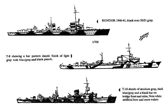
appears to be slightly different but conforming to two basic styles of dazzle
patterns. The first pattern was similar to patterns in use on British vessels
and also those used in the First World War. This was a simple pattern of large
areas of black or very dark gray over the hull sides and extending upward onto
the superstructure. The similarities suggest that they were influenced by British
practice as well as perhaps a continuation of the experiments in the late twenties
on MOWE class torpedo boats. PAUL JACOBS Z5 (April 1941), is a good example
of this style. The second pattern style used dark bars at various angles, sometimes
with an artificial perspective effect leading to an imaginary vanishing point
such as seen on THEODORE RIEDEL Z6, (1943). There were numerous variations within
these two basic pattern groupings with no two ships exactly the same. The same
ship could also carry several different schemes in its career.
The parallel band scheme, black and white bands or chevrons over 50/51 was introduced
in the spring of 1941. This marking system was restricted to battleships and
cruisers and only appeared on vessels while in the Baltic. It was intended to
disrupt rangefinding and also to confuse the identity of a ship as many German
ships had similar silhouettes. The black and white bands were usually combined
with a section at both bow and stern painted in dark gray for a foreshortening
effect with a false bow wave added in white or light gray. BISMARCK, PRINZ EUGEN,
NURNBURG, LEIPZIG, LUTZOW, EMDEN and DEUTSCHLAND all wore this scheme at one
time. None of the K class cruisers, KOLN, KONIGSBURG, KARLSRUE, appear to have
been painted this way. Only the KOLN survived long enugh to wear a scheme other
than 50/51 gray. The black and white band pattern was abolished by 1942.
|
1/700 Scale Drawings
|
|
|
|
Examples of Kreigsmarine dazzle camo
|
In 1942 some units, (examples - GNEISENAU, KOLN), were in overall
medium gray instead of the 50/51 combination. It was felt that the light gray
upper works were too visible and in bright lighting conditions appeared almost
white. A dull iron gray paint was issued which may have contained burnt umber
in the mix as suggested by Kkpt. Deshend. By the time she left Norway BISMARCK
was painted in this dark gray with only the foreshortening hull pattern with
false bow and stern waves remaining from her Baltic scheme. The turret tops
were also painted gray. Some destroyers were also painted in one color overall
from 1942, probably the dark gray. Some ships appear to have been repainted
with the peacetime hull gray overall. Dazzle schemes were applied over this
in the same way as with the 50/51 grays leaving portions exposed for an additional
color shade. A.T.D.K suggests that KOLN was painted in the dull iron gray while
in the Baltic but this scheme may have been a blue/gray overall. According to
A.T.D.K the GNEISENAU and SCHARNHORST were painted in the iron gray overall
scheme at the time of their channel dash. While this may be true for GNEISENAU,
SCHARNHORST actually carried a modified peacetime scheme at this time, 50/51
with dark spots, (darker gray?) on her upper works and with her turret tops
painted blue. SCHARNHORST did have the overall iron gray scheme with light gray
false bow and stern section later in the war.
GRAF SPEE on her famous raiding cuuise carried a similar pattern with peacetime
50/51 augmented with irregular dapple patterns on her bridge and upper works.
Early artist"s renderings, (such as the one in the Profile publication), showed
this as olive green but this is very unlikely. Probably the upper works pattern
was in dark gray or dark blue/gray. The GRAF SPEE was still wearing this pattern
at the end when she was scuttled off Montevideo harbor.
Schnellboats, (or E-Boats as the British termed them), were painted in multicolors
patterns as were some of the smaller combat units such as minesweepers. These
designs were very complex and were of several pattern styles. Some consisted
of small spots or bars in a very tight geometric pattern resembling "lozenge"
camouflage patterns seen on German aircraft in WW I. The spots or bars were
so tightly grouped that they tended to blend together at any distance and thus
were defeating the camouflage effect. Exact color combinations are difficult
to determine. Several variations were obviously tried. This style of camouflage
was recognized by the Kriegsmarine as being ineffective and was eliminated by
the end of 1942 although some smaller units appear to have retained the patterns
until much later in the war. Later, small unit camouflage patterns typically
followed the style of the destroyers. These consisted of solid panels or areas
painted out to disguise the silhouette, irregular bands, usually consisting
of two or a maximum of three colors or combinations of white, gray, blue-gray,
and black. A vertical "zebra" style was also tried, consisting of alternating
bands of white, gray, and black. Tugs, as the war progressed, lost their elegant
pre-war scheme and were repainted in various "dazzle" patterns, usually in combinations
of white, blue, medium gray, and black.
Merchant ship camouflage only began with the return to Germany of the liner
BREMEN in December, 1939. This was a very large ship and needed to be made
"inconspicuous". The BREMEN and her sister EUROPA were painted under contract
by a private firm in an almost identical pattern. This scheme is better documented
than most. The only colors that were in use by this company were: Weiss (30),
(White), Olivegrun (32 3), (Olive Drab), Blau (327) (Blue), and Schwarz, (33)
(Black), and the standard Dunklegrau, (51) Dark Gray. The same company also
painted the transport BELGRANO, the freighters EMMA SAUBER and EMILY SAUBER,
the battleship BISMARCK, and the target ship GOYA. One can assume that during
this time frame all of these ships would have carried camouflage patterns
consisting of only these colors.
|
1/700 Scale Drawings
|
|
|
|
Examples of Kreigsmarine dazzle
camo
|
In 1939 there were no official plans or instructions for the camouflage painting
of merchant vessels. No designs existed for either patterns or colors. It
was then decided that, as a basic standard camouflage, merchant ships were
to be painted in Dark Gray 51. A navy board was created to design colored
camouflage profiles for the various ship types. The new designs attempted
to divide the ships into round or angular geometric areas and to create patterns
that could be easily painted onto the ship's sides. The bow and stern areas
received special consideration with the objective of deceiving the eye in
determining the angle and speed, and secondarily, the length of the ship.
Distinctive features of the superstructures were to be "camouflaged out'.
One way this was attempted was to pick an unrelated area on the side of the
ship and paint in a spot or block, for instance, under the bridge front. It
was hoped that this would be distracting, thus confusing the observer. Random
geometric patterns were also used attempting to disguise the shapes and characteristics
and disrupt the silhouette. Essentially, most of the merchant ship camouflage
patterns evolved as an extension of the dazzle painting techniques of the
First World War. The colors were different, in some cases more subdued, but
a comparison of many patterns from both time frames show remarkable similarities.
Whatever they may have lacked in originality, the patterns worked quite well
against periscope observations and most optical range finders. The new color
design profiles were distributed to the various yards that did ship painting
work. They have apparently been lost as there is no record as to what happened
to them.
Colors commonly used in these multicolored "dazzle" patterns were: dark blue,
medium blue, white, black, dark gray, light gray and olive green. A few instances
of a rose color or dull red were supposedly incorporated in the patterns but
this was unusual. One interesting example that has appeared in several books
is a merchant ship in the Baltic with two smaller ship silhouettes painted
in dark blue on the sides of her hull. Recent opinion suggests that this may
not have been for the purposes of camouflage but rather for training, as a
practice target for friendly submarines. Probably no one knows, but it is
an interesting conjecture. Again I wish to thank Falk Pletcher for his invaluable
help which makes this series possible. As the series continues, I would welcome
any additional information or corrections.
|
Drawing
Not to Scale
|
|
|
|
Typical dazzle pattern using geometric
forms.
Copied from a photograh, the specific ship is unknown.
|
Merchant ships, as mentioned previously, received a homogeneous
color scheme as the war progressed. Early war and mid war saw many examples
of dazzle schemes very much like those used in WWI. Also, in the early days
of the war, many freighters retained their black hulls, only the upper works
being painted over in gray. A few received a warship style scheme of dark
gray hull and light gray upper works, for example, GENERAL ORORIO as a target
ship at Stettin. It should be noted that GENERAL ORORIO was taken over for
military service and was thus operated as a auxiliary. Few merchant ships
were painted this way unless they were pressed into Kriegsmarine service.
KAMERUN was used as a repair ship and her hull changed from the light gray
of the African liners to black.
Upper works were painted light gray and the funnel was black.
After a while a medium gray, (see part II), became the standard paint for
merchant ships unless they received one of the camouflage patterns. Usually
dazzle painted ships retained this pattern until their loss. A large number
of merchant ships were camouflaged in preparation for Operation Seelowe, (Operation
Sea Lion - the invasion of Great Britain), in 1940.
|
Drawing
Not to Scale
|
|
|
|
The Spanish Civil War period recognition
marking - as copied from a photo
|
The homogeneous scheme also included the funnels, although some
retained a broad black funnel top, (e.g. UBENA, USAMBARA, and CAP ARCONA).
Some had totally black funnels, (e.g. UTLANDSHORN and PIONEER). Merchant ships
operating in the Black Sea had black funnels and black and white ringed derricks.
This scheme is confirmed for ARKADIA, SALZBURG, MARBURG and INGO.
During the Spanish Civil War some merchant ships adopted a distinctive
recognition marking, a large black swastika on a white circle painted on the
sides of the hull, approximately midships. It is believed, though not confirmed,
that some had this markings on a red field, duplicating the Nazi flag.
Hospital ships conformed to international standards, hull and upper works
painted white, with a broad green band encircling the hull. Red cross markings
were painted on the funnels. Examples are the ROBERT LEY and WILHELM GUSTHOF.
We now begin a series of specific camouflage drawings for
all of the large ships of the Kriegsmarine down to torpedo boats. Falk Pletcher
has prepared the art for this series and has worked from photographs. Patterns
may differ slightly from some drawings in past publications. The first subject
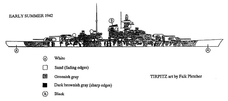
is the battleship TIRPITZ. In her long career she wore a variety of color
patterns. Prior to commissioning TIRPITZ, was painted in a irregular pattern
of different shades of gray, (or possibly other colors) for a short period
while fitting out. Only one photo has been found and this shows only the
upper part of the ship. The rectangular patterns on the "hull", (stated
in one source to be the only example of the Bild 4 scheme - painting to
resemble buildings), appears to be the painted sides of the drydock, not
the ship. Not enough information has been found to prepare a drawing of
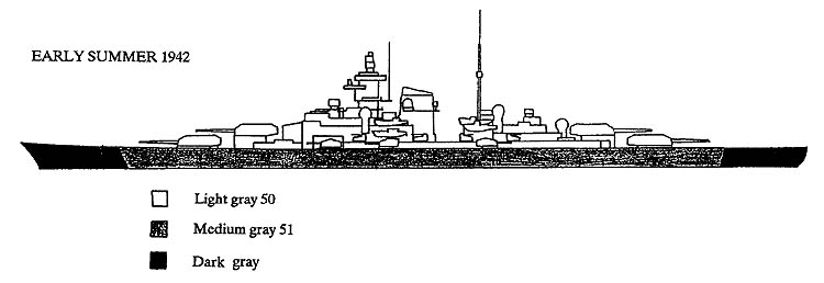
this early scheme. After commissioning and prior to her arrival in Norway,
TIRPITZ operated in the standard light gray 50, medium gray 51 pattern with
dark gray turret roofs and gun barrels. TIRPITZ never had the black and
white stripes commonly worn by ships in the Baltic Sea.
Drawings - Not to Scale
|
|
|
|
|
|
Tirpitz
Early Summer 1942
|
Tirpitz
Early Summer 1942
|
Tirpitz
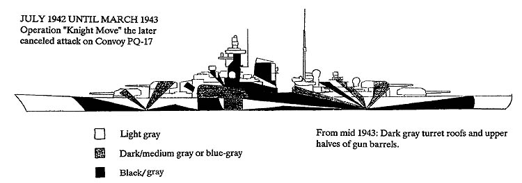
July 1942-March 1943
Operation Knight Move the later cancelled attack on Convoy PQ-17
|
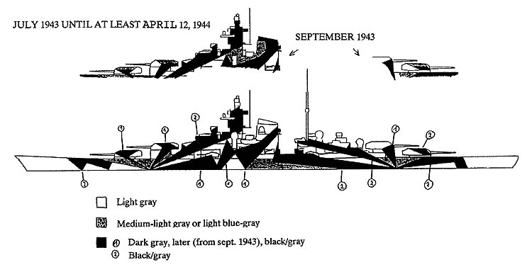
Tirpitz
July 1943 until at least April 12, 1944
|
|
|
|
|
|
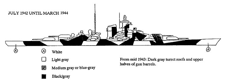
Tirpitz
July 1942 until March 1944
|
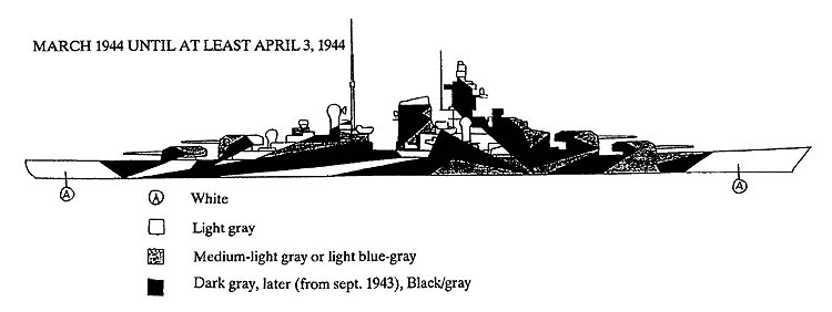
Tipitz
March 1944 until at least April 3, 1944
|
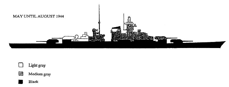
Tirpitz
May until August 1944
|
GERMAN KRIEGSMARINE CAMOUFLAGE COLOURS
Floquil colors were matched to Humbrol silk screened
chart under cool-white fluorescents,
Floquil matches by David Veres.
Schiffstarnfarben fur Uberwasserzwerke - Ship's above water
|
|
No
|
Designation
|
Description
|
Humbrol
|
Revell
|
Floquil
|
| |
|
30
|
Weiss
|
White
|
H34
|
-
|
18698
|
|
31-1
|
Hellgrau
|
Light gray
|
H64
|
-
|
303197
|
|
31-2
|
Dunkelgrau
|
Dark gray
|
H67
|
-
|
303159
|
|
32-1
|
Hellgruau
|
Lightgreen
|
2x H101 + H34
|
-
|
303267*
|
|
32-2
|
Dunkelgrun
|
Dark green
|
H86
|
-
|
303159
|
|
32-3
|
Olivgrun
|
Olive green
|
H86 + H64
|
-
|
303164
|
|
32-4
|
Hellbraun
|
Light brown
|
H84
|
-
|
303349
|
|
32-5
|
Dunkelbraun
|
Dark brown
|
H29
|
-
|
303139
|
|
32-6
|
Rosa
|
Pink (?)
|
-
|
-
|
-
|
|
32-7
|
Blau
|
Blue
|
H124
|
-
|
303157
|
|
32-8
|
Azur
|
Blue-Gray
|
H25 + H34
|
-
|
303155
|
|
33
|
Schwarz
|
Black
|
H33
|
-
|
818602
|
| |
|
Deckfarben - Deck colors
|
| |
|
50
|
Hellgrau
|
Light gray
|
H64 + 2x H34
|
-
|
303341
|
|
51
|
Dunkelgrau
|
Dark gray
|
H175
|
-
|
303257
|
|
58
|
Schlichgrau
|
Mud gray
|
H146
|
-
|
303327
|
|
58-1
|
Blaugrau
|
Blue gray
|
-
|
R79
|
303249
|
|
58-2
|
Blau-schwarz
|
Blue black
|
H67 **
|
R78
|
110017*
|
|
-
|
Linoleum
|
-
|
-
|
-
|
110179
|
|
23a
|
Wasserlinein
|
Waterline
|
-
|
R47
|
303247
|
|
23b
|
Wasserlinein
|
Waterline
|
H67 **
|
R78
|
110017**
|
| |
|
|
|
|
|
|
* Lighten with white
** Not exact match but close.
|
This article originally appeared in Plastic Ship Modeler 1995/2, 1995/3
and 1995/4 and is reprinted here with the permission of the author and editor.
Copyright © SMML 2003